ALPHAZER
Rebranding the alpha self for all athletes
Alphazer is a brand born to amaze, for years it has looked after the interests of athletes with top needs.
Based on accurate scientific and technological research, Alphazer was founded to define a new standard of sports supplements designed for athletes of all disciplines who want safe, highly certified and effective support to excel in performance and optimise their efforts. Nascent revamped the brand’s logo and their product packaging, and was tasked with restyling Alphazer’s entire communication online.
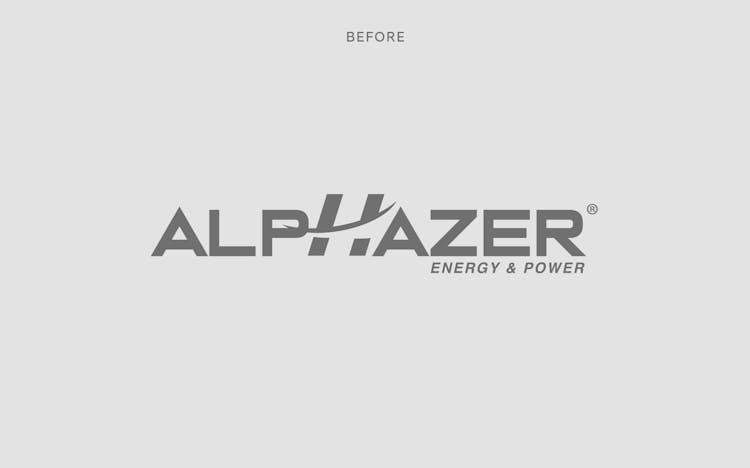
We redesigned the brand logo to one that is concisely articulate with italic lettering, highlighting the exhilaration of competitive sports.

The accent colour makes the visual language concentrated and pop on an otherwise monochrome foundation.
Varied use of typography, colour scheme and custom icons make up Alphazer’s new brand identity package that resonates with the brand’s core essence, value and tone of voice.

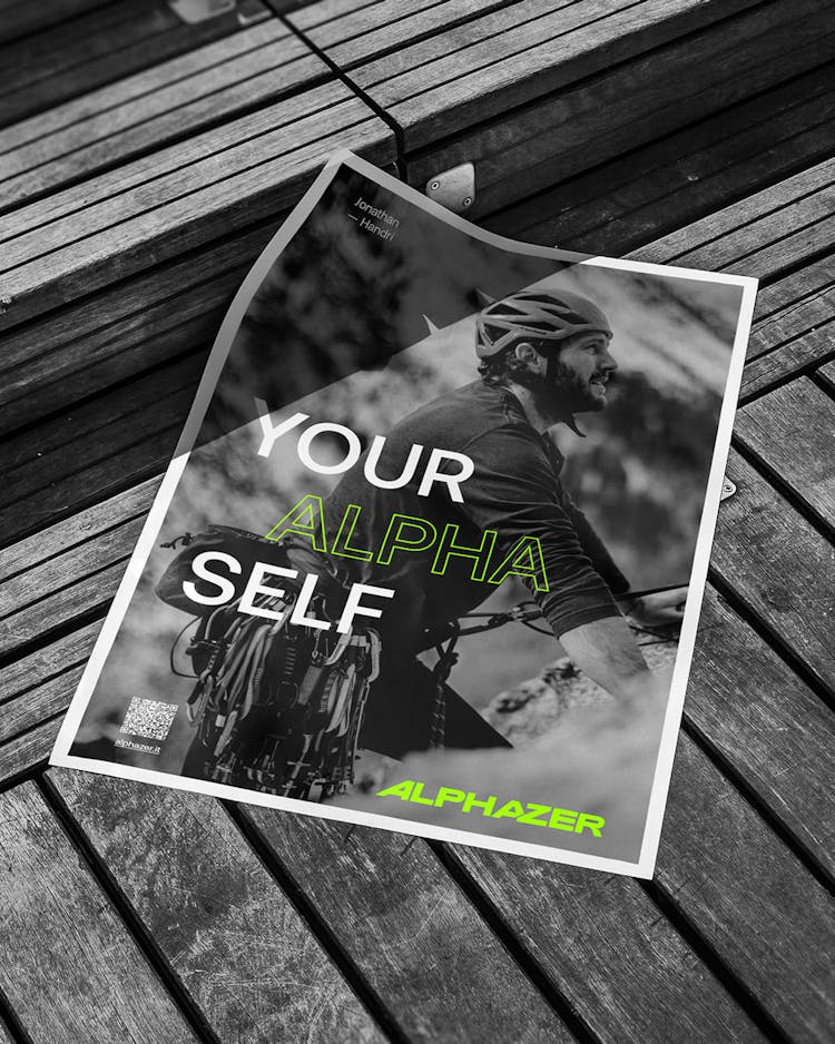
The refreshed brand identity is implemented on various communication materials.
OOH, printed and digital communication channels, such as the brand’s social media, are populated with refreshing, dynamic and engaging contents that highlights the potential of athletes with the support from Alphazer’s products.


The new identity system is primarily employed on Alphazer's instagram account, which engages their audience in a swift, interactive, and straightforward manner.


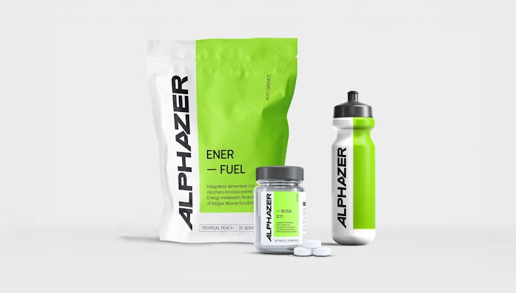
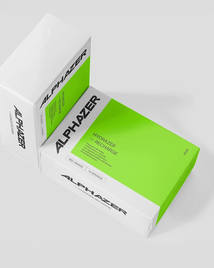
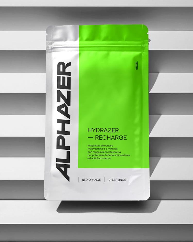
The bold, sharp and concise new identity extends to alphazer’s product packaging under retail context.
In the retail sphere, Alphazer’s new packaging design comes in variety of formats, enhancing their visual impression, establishing their brand language, and bringing their new identity closer to consumers.
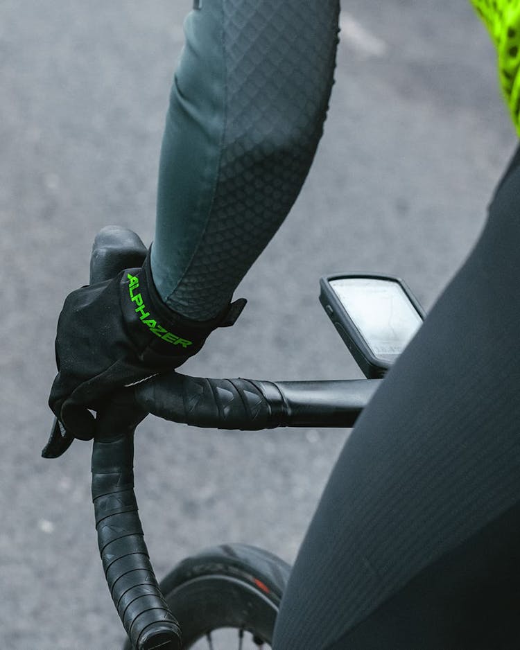
Alphazer’s new identity is also presented in applications such as a wide selection of apparel and merchandise offerings.

